
When building and training a machine learning model, understanding performance is essential. Depending on the training data and task, even the most advanced model can produce incorrect predictions, resulting in misleading analytics or faulty automation flows.
Manually wading through examples to check model predictions is impractical, especially for datasets with millions of data points. Instead, Re:infer continuously computes and displays multiple metrics to help to analyse models and spot failures.
However, under some conditions metrics can behave unexpectedly. In this blog post we discuss some of the problems that arise when using metrics, and some of the solutions Re:infer uses to simplify the process.
Re:infer in action
Re:infer allows users to build custom machine learning models for communications data. To understand how we use metrics during this process, it's useful to picture a specific use case.
Consider a shared mailbox for a bank, which may receive thousands of emails each day. Re:infer is used to automatically triage these emails to help employees using the mailbox to work more efficiently.
In a real use case, subject matter experts for the mailbox would create hundreds of labels to track and automate various workflows. For our purposes we'll consider a simplified case
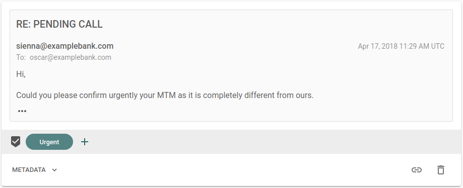
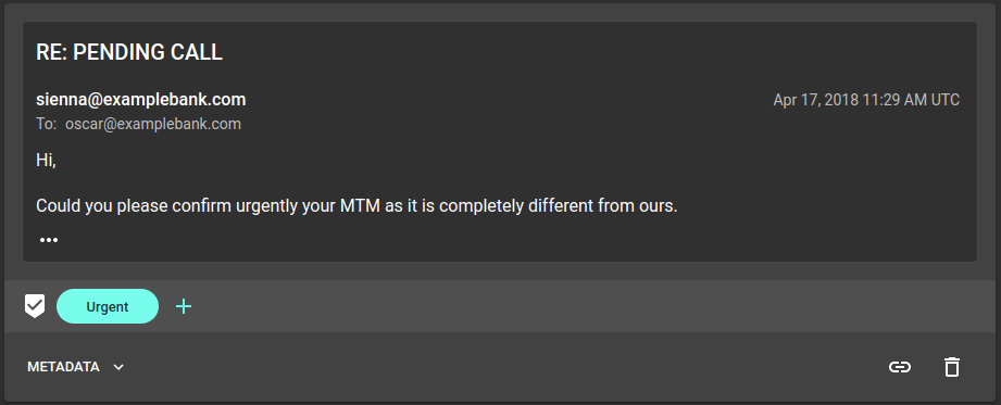
- Urgent emails. These need to be detected and flagged in the employees' email clients.
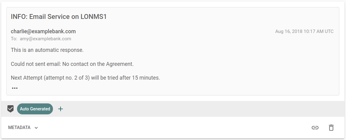
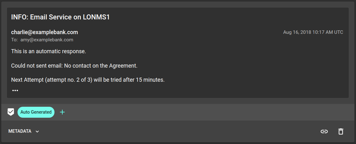
- Auto-generated emails. These should be detected and moved to an archive folder to keep the inbox clear.
The user creates Urgent and Auto Generated labels for these tasks and
annotates some example emails. Re:infer automatically trains a ML model that
predicts which labels apply to an email. This model is then used to automate the
email triage tasks for live data.
In this context, we want a metric which indicates how good the model is at recognising these two labels.
Comparing predictions
At the lowest level, metrics compare label predictions to correct answers, in the form of Yes/No label annotations created by users.
Models in Re:infer don't provide binary (yes/no) predictions on label presence. Instead, they return a number between and . This represents the model's confidence that a label applies.
Model confidence values are converted into binary label predictions using a threshold. This is simply a number between and which partitions confidence values for a label.
- Above the threshold the label is predicted to apply (a "positive" example).
- Below the threshold the label isn't predicted to apply (a "negative" example).
Using annotations, label predictions, and a threshold we can split a set of examples into four distinct groups
- True positives (TP). The model predicts a label and the label applies.
- False positives (FP). The model predicts a label and the label doesn't apply.
- False negatives (FN). The model doesn't predict a label and the label does apply.
- True negatives (TN). The model doesn't predict a label and the label doesn't apply.
Changing the threshold for a label will affect which emails fall into each of these four groups, which act as the starting point for many metrics.
Accuracy
We might be tempted to look at the accuracy of our model.
Of all the model predictions, what fraction are correct.
This seems reasonable, and accuracy is often considered the go-to metric for AI performance. However, in some cases accuracy can be deceptive.
Urgent emails might be rare in the mailbox, with only 1 in 25 emails actually
belonging to this class. For a bad model which never predicts the Urgent label
for any email, we get an accuracy score of:
This score is high, but our model is actually performing poorly. Accuracy can
overestimate performance on tasks with rare labels such as Urgent and
Auto Generated.
Precision and recall
Instead of accuracy, we can use two values known as precision and recall to give a better measure of model performance.
Of the comments which the model predicts as having the label, what fraction actually have that label.
Of the comments which actually have the label, what fraction does the model predict as having the label.
Using the same example of 1 Urgent label in 25 comments, our model would get
precision and recall values of . This highlights how poorly this model is
performing.
These metrics perform better on labels which occur with different frequencies, known as class imbalance. Topics in communications data seldom occur at the same rates, so it's important that the metrics in Re:infer account for this.
Different labels, different goals
For a given threshold we can calculate the precision and recall values. However, there is actually a trade-off between these two metrics
- High precision. Requires few false positives. This means a high threshold so only examples with model confidence close to 1 are "positive".
- High recall. Requires few false negatives. This means a low threshold so only examples with model confidence close to 0 are "negative".
It's easy to get a good score for precision or recall (by setting thresholds close to or close to respectively). Setting a threshold represents a balance between the two, and the best trade-off depends on what the label is used for.
Balancing costs
For the banking example, it's much worse to treat an email with useful content
as auto-generated and incorrectly archive it than to leave a few auto-generated
emails in the mailbox. This means the Auto Generated label should have high
precision (few false positives).
On the other hand, the model shouldn't miss urgent emails, but it's acceptable
for some non-urgent emails to have this label. This means the Urgent label
should have high recall (few false negatives).
The optimal threshold for a label minimises the cost when the model makes a mistake.
For the sake of argument, assume it costs the bank £5 for every missed urgent email (false negative) and £10 for every email wrongly marked as auto-generated (false positive). The bank also pays an employee £20 an hour to remove incorrect urgent and missed auto-generated emails at a rate of 100 per hour.
For a mailbox which receives 1000 emails a day, thresholds can be tuned to minimise the expected cost per day.
Scoring without thresholds
Precision and recall need a threshold for each label. Setting these thresholds is slow, especially for large datasets which may have hundreds of labels. A metric that works without an optimal threshold is more useful.
To do this, we calculate precision and recall for a range of thresholds. These values are then plotted as a precision/recall curve, which we use to check model performance.
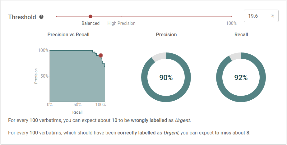
Perfect models
Consider a hypothetical "perfect" model which predicts every label correctly. There will be a threshold where this model has 100% precision and recall.
Above this threshold, some positives will be incorrectly identified as negatives. This lowers precision, but keeps recall at 100%. Similarly, lowering the threshold will incorrectly tag negatives as positives. This lowers recall but keeps precision at 100%.
By this logic, the precision/recall curve for a perfect model is a box shape with the corner at the point . Any imperfect model will have a curve below this perfect model.
This means improving a model is the same as increasing the area under the precision/recall curve.
Average precision
This leads to our final metric: Average Precision.
The area under the precision/recall curve.
The closer this value is to , the better the model.
While we do let users pick thresholds and explore the precision/recall tradeoff, average precision is the headline metric we use to score models in Re:infer. It works well on average, especially in cases when false positives and false negatives have similar costs. Because it uses precision and recall, it is robust to class imbalances but users don't need to set a threshold to calculate it.
We report this metric in two ways on the Validation page
- Average Precision. The performance of an individual label, reported for each label.
- Mean Average Precision. The Average Precision for each label, averaged across all labels. This measures the performance of all labels in the dataset.
Precision and recall aren't everything
We use metrics to estimate model performance, but this estimate is only as good as the data we use to calculate it. Even though we evaluate models on a test set separate from the one it was trained on, that test set is still drawn from the examples annotated by users. If that data isn't representative of the target task, our metric may be misleading.
For the banking example, imagine we only label urgent emails sent on Mondays, and auto-generated emails sent on Fridays. A model trained on these examples could predict labels perfectly from just the day the email was sent.
The average precision for the model would be high, as it identified a pattern that always works on the user-annotated data. However, urgent and auto-generated emails can be sent on any day. On live emails, the pattern wouldn't work and the model would perform poorly.
This is why when we score models in Re:infer, we don't just return precision, recall, and average precision values. Instead, we calculate a model rating.
Model ratings consider many different performance factors, not just average precision. This holistic view alleviates the pitfalls of using a single metric, while providing clear model feedback. In a future post we'll explore model ratings in more detail, and how they have be used to build better models in less time.
Summary
- Precision and recall accurately measure performance for labels with different frequencies.
- Average precision measures model performance without requiring a threshold.
- No single metric gives a complete picture. Even precision and recall have blind spots when training data is poor or poorly collected.